Media Queries in CSS
I don’t know anything much about design but as my staff development involves working with mobile applications and responsive themes I thought it high time I tried to build up a basic responsive layout using various online sources.
I have used the new portal site I have been working on as the target of the theme. My main goals with this theme are:
- Respond to different client resolutions using media queries
- Do not rely on javascript to achieve anything which can be done by pure CSS
- Support the broadest range of modern browsers and devices possible.
Respond to different client resolutions
This is the first I have heard of media queries but it seems fairly straightforward to use a different style sheet using the width of the target device screen. I have created three style sheets links which contain resolution specific tags. (There are two other style sheets: one for font-awesome and a basic style.css for global colours etc).
media='screen and (max-width: 700px)' href='css/narrow.css'
media='screen and (min-width: 701px) and (max-width: 1049px)' href='css/medium.css'
media='screen and (min-width: 1050px)' href='css/wide.css'
The minimum and maximum widths were arrived at using the excellent Browserstack with a broad range of different devices.
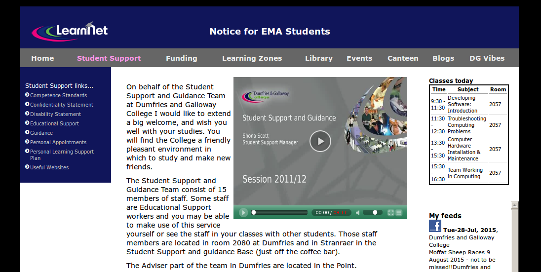
For a decent resolution desktop machine the page layout looks like this:
If the chosen page has child pages they appear in the menu at the left and the main content is contained in a smaller area. This is achieved by using two different div ids for the main content decided server side before the page is rendered (main-content and main-content-wide). If there are no child pages it’s safe to use main-content-wide like so:
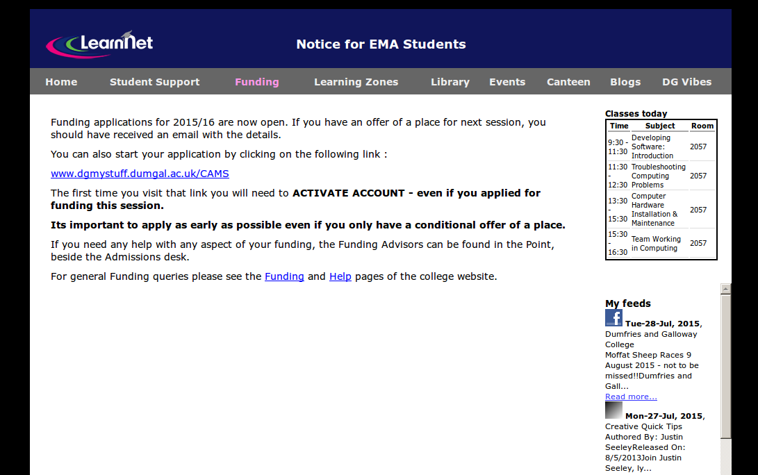
If the page width drops below 1050px the timetable and feeds areas are gently pushed below the main content to allow some breathing space and the main menu titles are slimmed down as shown here:
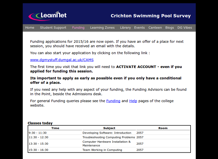
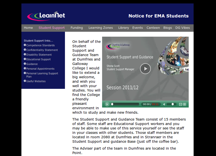
If there are child pages there is still enough room in this medium layout for the child menu:
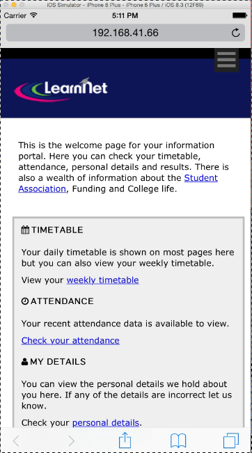
If the browser falls below 700px the ‘mobile’ style sheet is employed.
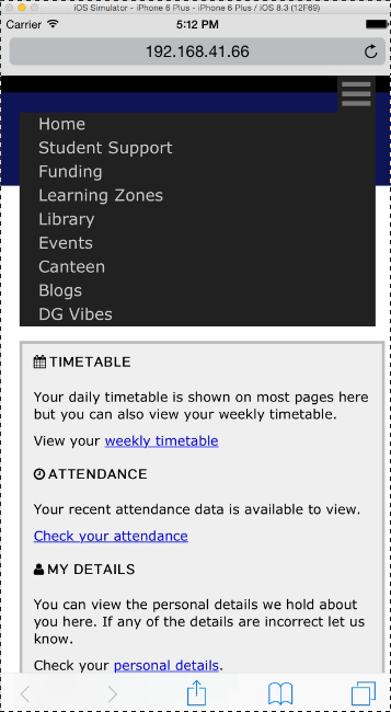
I wanted to show one of those mobile menus instead of the main menu list. I found an excellent solution on this website. I don’t fully understand how this works but it’s based on a checkbox followed by a label. The checkbox is hidden but can still be checked which triggers this piece of css:
    [type="checkbox"], label { display: none; }

    [type="checkbox"]:checked ~ ul {
          display: block;
          z-index: 9999;
          position: absolute;
          right: 20px;
          left: 20px;
    }
This has allowed a mobile style menu to appear without relying on javascript. The compatibility is good too. Here it is on an iPhone 6 simulator. When you click the mobile menu button you check the unseen box then the contents after the label are displayed:
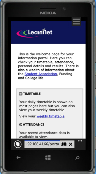
Now a Nokia Lumia 925 Windows phone:
I tried some early non-HTML 5 browsers but they are a bit of a disaster. IE6 for example is a no-go. No-one should really still be using it anyway !