Useful Links for Upgrading Moodle Plugins to 4.0
Some information to refer back to while upgrading plugins and themes ready for our summer upgrade in 2023.
Some information to refer back to while upgrading plugins and themes ready for our summer upgrade in 2023.
Some useful links to Moodle documentation I’ve picked up while working through the Developer Moodle Academy Courses for my future reference.
A very quick overview on what you need to add to add a block region in a Moodle theme template.
Create a region id name then add it to your ‘regions’ paramater array for the page template (or templates) you want to use that block region on. You’ll need to set a defaultregion if you have a set region.
$THEME->layouts = [
    'base' => array(
        'file' => 'columns2.php',
        'regions' => array(),
    ),
    'frontpage' => array(
        'file' => 'frontpage.php',
        'regions' => array('side-pre','side-top'),
        'defaultregion' => 'side-pre',
    ),
];You will want to add the following lines of code to this file (or the template file you are adding the region to).
$blockshtml = $OUTPUT->blocks('side-pre');
$topblockshtml = $OUTPUT->blocks('side-top');

$hasblocks = strpos($blockshtml, 'data-block=') !== false;
$hastopblocks = strpos($topblockshtml, 'data-block=') !== false;
In your template context you’ll want to add the following parameters
$templatecontext = [
    ...
    'sidepreblocks' => $blockshtml,
    'sidetopblocks' => $topblockshtml,
    'hasblocks' => $hasblocks,
    'hastopblocks' => $hastopblocks,
    ...
];Then in your template mustache file you will want to add the following to display any blocks in that region on your page.
{{#hastopblocks}}
	<aside data-region="blocks-column" class="d-print-none topblocks py-1 px-2" aria-label="{{#str}}blocks{{/str}}">
		{{{ sidetopblocks }}}
	</aside>
{{/hastopblocks}}You’ll also want to add a language string for any new block regions you add.
$string['region-side-top'] = 'Top Region';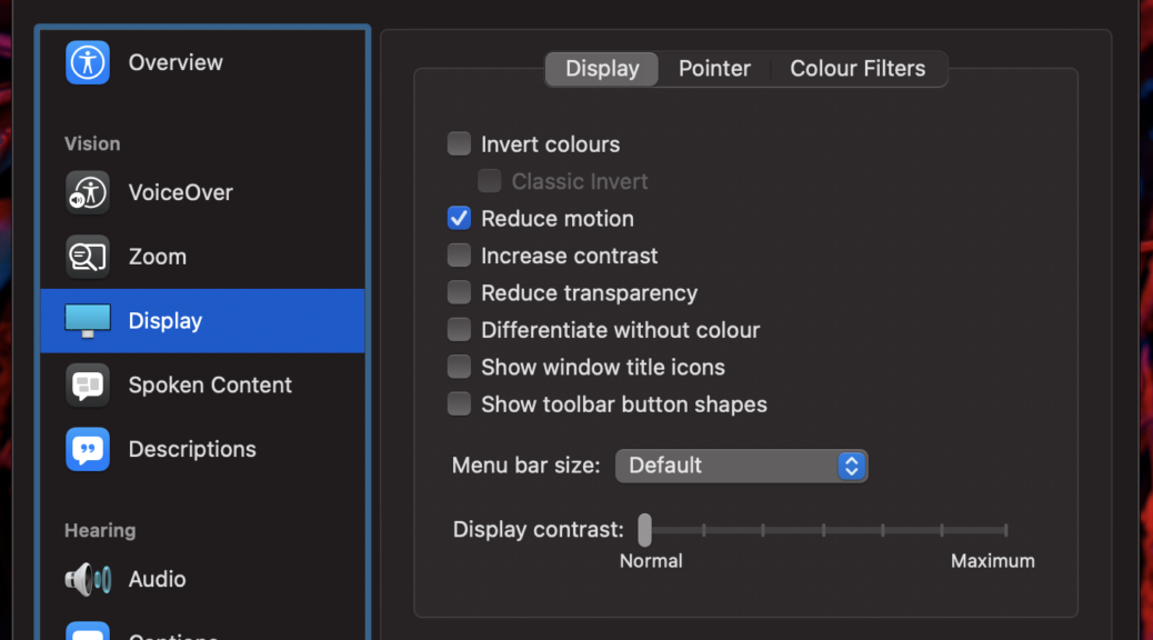
A few months ago I came across a media query for Reduced Motion in CSS. Some users may find some animated motions on websites can make them feel ill. These users can switch on the Reduced Motion setting in their operating system to try and limit these motions.
As web developers we can help by using CSS (and javaScript) to respect that setting.
Within the media query you can add settings to prevent transitions or animation from happening.
You can even add a wildcard rules so that any transitions or transforms and animations are prevented as I have in the code below.
/* Tone down the animation to avoid vestibular motion triggers like scaling or panning large objects. */
@media (prefers-reduced-motion: reduce) {
	html {
		scroll-behavior: auto; // override smooth scrolling
	}
	* {
		transition: none !important;
		animation: none !important;
		transform: none !Important;
	}
}You may find the wildcard approach may disable some transitions or transforms or animations you want to keep so you may have to add some overrides when using that approach or use the css :not notation to ignore certain classes or elements.
/* Tone down the animation to avoid vestibular motion triggers like scaling or panning large objects. */
@media (prefers-reduced-motion: reduce) {
	html {
		scroll-behavior: auto; // override smooth scrolling
	}
	* {
		transition: none !important;
		animation: none !important;
	}
        // this ignores the elements and classes specified but targets everything else.
	*:not(path, text, g, polyline, rect, svg, clipPath, image, .svg, .mapholder, use) {
		transform: none !Important;
	}
}For JavaScript you can use the following code to check if the user has reduced motion set. Then test the matches – if it returns true then the user has reduced motion set.
var mediaQuery = window.matchMedia('(prefers-reduced-motion: reduce)');

if(mediaQuery.matches) {
	$('#'+defid).toggle();  // show and hide rather than...
} else {
	$('#'+defid).slideToggle();  // sliding up and down
}
https://www.smashingmagazine.com/2020/09/design-reduced-motion-sensitivities/
https://alistapart.com/article/accessibility-for-vestibular/
Instal WP CLI on the server the WordPress is hosted on : https://wp-cli.org/#installing
Setup an update script using WP CLI commands:
#! /usr/bin/env bash
# Update all WordPress Plugins
wp plugin update --all
# Update all WordPress Translations
wp language core update
# Update WordPress Core
wp core update
# Update WordPress Database
wp core update-db
# Check no plugins need to be updated after core wordpress update.
wp plugin update --all
Setup a scheduled task in linux crontab to run the script
0 4 * * * user /path/to/task/wpupdates.sh >> /path/to/logs/wordpress-$(date +\%d-\%m-\%Y).log 2>&1Make sure that the user is the same as the folder owner
Make sure that the script is executable.
https://chrome.google.com/webstore/detail/web-developer/bfbameneiokkgbdmiekhjnmfkcnldhhm
https://addons.mozilla.org/en-GB/firefox/addon/web-developer/
Useful for seeing what order information appears in and for checking the alternative text on images is good enough to be understandable.
https://wave.webaim.org/extension/
Useful for seeing where your web page may be failing and potential solutions.
https://www.tpgi.com/color-contrast-checker/
Useful tool for Windows and Mac which allows you to check colour contrast on various elements.
My notes from working out how to build a plugin for Moodle’s Atto Editor.
(This post is not entirely finished – working out the dialogs)
Atto Editor plugins can be found in /lib/editor/atto/plugins as defined here and listed here
Note an Atto Plugin is known as a sub-plugin rather than a full plugin although it follows a similar format.
defined('MOODLE_INTERNAL') || die();

$plugin->version   = 2022030700;        // The current plugin version (Date: YYYYMMDDXX).
$plugin->requires  = 2020061511;        // Requires this Moodle version.
$plugin->component = 'atto_pluginname';  // Full name of the plugin (used for diagnostics).
Current Moodle version can be found in Moodle’s own version.php file.
The component name is {plugin_type}_{plugin_name}
In this case the plugin type is “atto”
This will contain all the translatable language strings for this plugin.
It should follow the frankenstyle naming convention of {plugin_type}_{plugin_name}.php i.e. the component name set in version.php
It should at least contain the name of the plugin in there.
$string['pluginname'] = 'Plugin Name';This is currently required but looking at the documentation it looks like Moodle are planning on replacing YUI with something else in the future. I worked through the documentation and experimented with it and have recorded more information below.
Moodle used to use shifter to compile the YUI modules in the past. According to documentation it currently uses Grunt to compile the JS now but the documentation isn’t fully up to date on how this works in practise. I found much more information on how to use shifter so started off with this and will work on shifting to Grunt.
{
  "name": "moodle-atto_pluginname-button",
  "builds": {
    "moodle-atto_pluginname-button": {
      "jsfiles": [
        "button.js"
      ]
    }
  }
}
Note the name “moodle-atto_pluginname-button” in “Builds” indicates the name of the folder it compiles to. The “Name” indicates the name of the javascript files after compiling.
{
    "moodle-atto_boostrap4moodle-button": {
        "requires": [
            "moodle-editor_atto-plugin"
        ]
    }
}Moodle Documentation has a list of examples for this file. Update the examples to use your component and plugin name. e.g. in the atto_strike example you would replace “atto_strike” with “atto_pluginname”
This is the old way of compiling the YUI module and reading through the threads on it, YUI will eventually be replaced but that may be sometime away yet due to the complexity. I’m going to take a look at compiling with Grunt as well but found more information on shifter so looked at it initially as a temporary way of compiling the YUI module.
To use shifter you need to have node.js installed then install shifter.
npm -g install shifterOnce installed navigate to your YUI /src folder and run the shifter watch command.
 cd ../yui/src/
 shifter --watch
Any change you make in button.js after that will cause the compiler to recompile all the files into the build folder.
Icons need to be stored in /pix/filename within the plugin. SVG is supported 😊
They can then be referenced in button.js when creating a button – example below:
		this.addToolbarMenu({
			icon: 'e/bootstrap',
			iconComponent: 'atto_pluginname',
			title: 'pluginname',
			globalItemConfig: {
				callback: this._changeStyle
			},
			items: items
		});
The icon name “e/bootstrap” is referring to an image stored at /pix/e/bootstrap.svg inside the plugin.
The iconComponent name is the plugin component name so it know to look in /lib/editor/atto/plugins/atto_pluginname
The title “pluginname” is reference to a language string in /lang/en/atto_pluginname.php
I’ve added a few examples of what you can do in the YUI module. I learned a lot of this looking at the code for Core Moodle Atto plugins. A good one to check out is the atto_table plugin.
You can reference language strings in your YUI module with the following reference:
M.util.get_string("stringReference", component)Replace “stringReference” with the name of your string located in /lang/en/atto_pluginname.php
The variable component should be declared somewhere in the code and be the component name of your plugin e.g. atto_pluginname
The string should also be listed in the lib.php file for the plugin in the function atto_pluginname_strings_for_js (replace atto_pluginname with your plugin component name).
function atto_pluginname_strings_for_js() {
    global $PAGE;

    $PAGE->requires->strings_for_js(array('stringReference'),
                                    'atto_pluginname');
}
Reference : https://docs.moodle.org/dev/Atto#Atto_subplugin_Php_API
If using mustache templates you can also reference these strings using the following reference and passing the variable via javaScript
{{get_string "stringReference" component}}var component = 'atto_pluginname',
EXAMPLETEMPLATE = '<div>{{get_string "stringReference" component}}</div>';You can then use the below code to convert the mustache strings in the example template to the Language strings stored in your plugin language file ( /lang/en/atto_pluginname.php ). Remember to pass the component name (usually stored in a variable) and to reference the string in the plugin’s lib.php file otherwise it won’t work!
/* This example function can pass form content to a dialogue box in Atto */
_getDialogueContent: function() {

		// this will be the form template.
		var finaltemplate = Y.Handlebars.compile(EXAMPLETEMPLATE);

		// insert variables into the template
		var content = Y.Node.create(finaltemplate({
			component: component
		}));

		return content;
}, /**
* Change the title to the specified style.
*
* @method _insertTemplate
* @param {EventFacade} e
* @param {string} template
* @private
*/
_insertTemplate: function(e, template) {
this._currentSelection = this.get('host').getSelection();
var host = this.get('host');
// Focus on the last point.
host.setSelection(this._currentSelection);
// And add the template. e.g. <p>test</p>
host.insertContentAtFocusPoint(template);
// Mark as updated
this.markUpdated();
}A callback that can be added to globalItemConfig: { } to insert a HTML template into the main content editor. This can be extended to fill in information from a dialog form.
Note: I think there is probably a way to compile the template passed in like there is for the form dialogue but I ended up writing a custom one for inserting into Editor Content because if I use the same method as form dialogue it goes wrong – I’m suspecting I don’t have a setting right somewhere but I need to look deeper into this!
/**
	 * Replace Mustache Placeholders with content
	 *
	 * @method _replaceMustache
	 * @param {string} template (html)
	 * @param {object} variables
	 * @private
	 */
	_replaceMustache: function(template, variables) {

		// holder for the final output.
		var finalHtml = template;

		// this next bit is only if we have variables to play with.
		if(typeof variables == "object" && Object.keys(variables).length !== 0) {

			// Loop through the object
			for (const [key, value] of Object.entries(variables)) {

				// find each mustache key and replace with the value.
				var regex = new RegExp(`{{${key}}}`,`g`);
				finalHtml = finalHtml.replace(regex, value);

			}

		}

		return finalHtml;
},A few things that tripped me up while working out how to get this to work!
Check it has been set in Site Administration > Plugins > Text Editors > Atto HTML Editor -> Atto Toolbar Settings ( ../admin/settings.php?section=editorsettingsatto )
Add “pluginname = pluginname” to the bottom of Toolbar Config to make it show at the end of the toolbar. You can also insert it inside a group of icons if needed.
Note you should change “pluginname” to match your component name
Question for later : is it possible to add it by default or is that a bad idea and if so why?
If a string is called in the YUI js files it must be specified in the language strings file in order to show. Otherwise you will get errors!
It also may need to be specified in lib.php in the atto_pluginname_strings_for_js() function.
function atto_pluginname_strings_for_js() {
    global $PAGE;

    $PAGE->requires->strings_for_js(array('accordion',
										  'pluginname',
										  'h3',
                                          'h4',
                                          'h5',
                                          'pre',
                                          'p'),
                                    'atto_pluginname');
}This seems very obvious in hindsight but although the documentation only mentions requiring yui/src/button.js you actually need javascript files in /yui/build/moodle-atto_pluginname-button/ to exist for example : moodle-atto_pluginname-button.js as well for this to work. Otherwise it just won’t load and you’ll get a missing module message in dev tools console. These files get automatically created when you compile with shifter or (presumably) Grunt.
One of those silly obvious ones but make sure any custom functions you add are separated by a comma!
https://docs.moodle.org/dev/Atto
https://docs.moodle.org/dev/Frankenstyle
https://docs.moodle.org/dev/YUI/Modules
https://docs.moodle.org/dev/YUI/Shifter
https://docs.moodle.org/dev/Grunt
Moodle Academy Development Path
https://moodle.academy
Introduction to Web Accessibility
https://www.edx.org/course/web-accessibility-introduction
Some Useful links for later reading:
https://ithemes.com/blog/wordpress-5-9/
https://github.com/WordPress/theme-experiments/tree/master/emptytheme
Some notes, interesting quotes, videos and useful links for accessibility on the web and in apps that I’m noting down as I learn more about Accessibility.
Understand how users with different disabilities use the web
Users won’t always be able to see the screen and won’t always be using a mouse and keyboard.
Disabilities can include
“around 15 to 20% of people require accessibility — over 1 billion worldwide!”
“The most important thing is making technology work well for people with disabilities.”
W3C / introduction to Web Accessibility (Edex)
Making the web and apps accessible can benefit more than just users with disabilities. It can help all users by making content easier to understand, easier to read, clearer and easier to access where connectivity is a problem.
As an example one of the first Typewriters was invented to help Pellegrino Turri’s blind friend to write more legibly.
https://en.wikipedia.org/wiki/Pellegrino_Turri
Vision, hearing, cognitive ability and physical ability can also deteriorate over time as we get older.
“When we work on making our devices accessible by the blind,
Tim Cook, CEO of Apple
I don’t consider the bloody ROI.”
Accessibility overlaps with User Experience and User Interface Design.
All design should follow a cyclical process of :
A Cyclical Process
The web and accessibility standards are constantly evolving and growing so we need to keep reviewing and improving our UX constantly. People also need to be continually trained on how to create accessible content. We all have a corporate social responsibility to make the web and apps accessible as well as a legal one. Accessibility is a human right.
Content should be presentable in different ways so it can be perceived by all users.
Websites and apps should be operable by all users regardless of disability
Content should be understandable for all users.
Website, Apps and their content should be interpreted reliably by a variety of different devices.
https://www.w3.org/WAI/standards-guidelines/wcag/glance/
Be consistent with your pattern designs
For example do we really need 22 different buttons styles, when one or two would do?
Pattern Libraries can be useful in mitigating this across teams so team members can refer back to the reference.
“Interfaces that break too many rules may win design awards, but they’ll also alienate users. As a rule of thumb, users should be able to look at any part of your interface and think, “I’ve seen something like this before”. Not exactly like it, but like it.”
Inclusive Design Principles: Be Consistent by Henny Swan
Accessed 4/02/22 : https://www.tpgi.com/inclusive-design-principle-be-consistent/
Videos should have closed captions for both blind and deaf users. Audio Descriptions can also be useful in making the videos understandable to blind or partially sighted users. Captions can be read out by screen readers so blind users can also follow along as well.
Captions are synchronised with the video content so they appear at the right time for users who can’t hear the spoken words or have trouble understanding what has been said.
YouTube will automatically create Closed Captions for you, but you should review these before publishing as they won’t be 100% accurate and may have some hilariously wrong translations in there. e.g. YouTube cannot translate the name of our college Dumfries and Galloway College.
https://www.w3.org/WAI/fundamentals/accessibility-principles/#captions
https://www.w3.org/WAI/media/av/
Transcripts are optional for videos whereas captions are required. They can be useful for users who don’t want to watch the video and would rather have it read out to them.
They are essential for Audio only files such as Podcasts.
Sign language can also be used on videos so a deaf user who knows sign language can follow the content. They can create a richer experience for deaf users whose first language may be sign language.
Images and multimedia such as charts should have alternative text so that they can be read by Screen Readers or converted to brail and be understood by blind or partially sighted users. This is especially important where the image or non text media is used to impart information.
This text will depend a lot on context. For instance if you had a picture of a woman wearing a blue shirt and the context was a shopping website selling blue shirts you probably want the image alt text to mention that the woman is wearing a blue shirt and describe that shirt.
If the image has text in it that is readable you should reproduce this text in the alt tag as well.
Alt text should be succinct and understandable to the user.
Any empty alt tag indicates that the image is decorative and can be ignored this is not the same as a missing alt tag. You can also use aria-hidden=”true” but be aware that not every device will recognise this.
<img src="example.jpg" alt="A young woman in a floaty pale blue shirt" />
<img src="decorative.png" alt="" aria-hidden="true" />
https://www.w3.org/WAI/fundamentals/accessibility-principles/#alternatives
https://www.w3.org/WAI/tutorials/images/
Responsive websites can also help users when using zoom to resize the text on their screen to make it larger or smaller if they are coded correctly.
One size does not fit all!
Don’t assume that larger text is more accessible than small text. For some users this is not the case. Users with tunnel vision may actually prefer small text with tight linespacing because they can read more of the words at once making reading quicker and easier for them. This is why being able to adjust the text on the screen can be useful. Your web page should support adjusting text size so that text does not overlap when font size is increased. Avoiding fixed dimensions and using %’s, ems and rems rather than px or pt can help with this.
Larger buttons, links an checkboxes with spacing around them are easier to hit or tap particularly by users who have poor motor control or tremors.
Colour contrast between textual information and its background should have a decent contrast so it is clear to the reader. Where colour is used as an indicator there should also be an alternative indicator for the colourblind so the differences are clear. E.g. underlines under text links.
“Colour (color) blindness (colour vision deficiency, or CVD) affects approximately 1 in 12 men (8%) and 1 in 200 women in the world. In Britain this means that there are approximately 3 million colour blind people (about 4.5% of the entire population), most of whom are male.”
Colourblind Awareness https://www.colourblindawareness.org/colour-blindness/
“Around 15% of people over 45 have some form of reduced vision”
W3C / Introduction to Accessibility
“The contrast ratio should be at least 4.5:1 and ideally 7:1 for text. For graphical objects, such as charts, and for large text, a contrast ratio of 3:1 may be sufficient.”
W3C / Introduction to Accessibility
https://www.tpgi.com/color-contrast-checker/ (Colour Contrast Tool Windows & Mac)
Making search boxes on text boxes voice activated gives users the option to enter in information using speech.
Make animation and movement on a website optional. Make use of web browser indicators to turn this off where a user has this option set.
How page content is structured can make it easier to understand for all users.
Headings help break up the text and make it easy to navigate and find information for all users.
Some things like logins and navigation should be kept where the user would expect to find it.
Tooltips and hover content can be lost when screen magnification is on.
Cognitive Accessibility Design
https://www.w3.org/WAI/fundamentals/accessibility-principles/#distinguishable
Being able to easily disable audio in order to hear the output of a screen reader is a must.
Having this option can help reduce glare or eyestrain. Some users may find content is easier to read by changing the setting to either dark mode or light mode.
“Assistive Technologies refer to hardware or software that enable people with disabilities to interact and engage with the digital environment e.g. using a screen reader or a switch control.”
W3C / Introduction to Accessibility
“Adaptive Strategies are techniques that people with disabilities use to interact with the digital environment such as adjusting platform and browser settings or resizing browser windows.”
W3C / Introduction to Accessibility
How People with Disabilities use the Web
These are used to help blind or low vision users to understand video content. They can also be useful to users with cognitive disabilities or users who are in noisy or quiet environments. They can also be used to help support children learning how to read.
These include:
Table of the standard keystrokes:
| Interaction | Keystrokes |
|---|---|
| Navigate to most elements | TabShift + Tab – navigate backward |
| Link | Enter |
| Button | Enter or Spacebar |
| Checkbox | Spacebar – check/uncheck a checkbox |
| Radio buttons | ↑/↓ or ←/→ – select an optionTab – move to the next element |
| Select (dropdown) menu | ↑/↓ – navigate between menu optionsSpacebar – expand |
| Autocomplete | Type to begin filtering↑/↓ – navigate to an optionEnter – select an option |
| Dialog | Esc – close |
| Slider | ↑/↓ or ←/→ – increase or decrease slider valueHome/End – beginning or end |
| Menu bar | ↑/↓ – Previous/next menu optionEnter – expand the menu (optional) and select an option.←/→ – expand/collapse submenu |
| Tab panel | Tab – once to navigate into the group of tabs and once to navigate out of the group of tabs↑/↓ or ←/→ – previous/next tab. |
| ‘Tree’ menu | ↑/↓ – Navigate Previous/next menu option←/→ – expand/collapse submenu, move up/down one level |
| Scroll | ↑/↓ – scroll vertically←/→ – scroll horizontallySpacebar/Shift + Spacebar – scroll by page |
Techniques for Keyboard Navigation
Common screen readers include Jaws for Windows, NVDA for Windows, Narrator bundled with Windows, VoiceOver bundled with MacOS and iOS, and TalkBack bundled with Android.
Remember : Not all Screen Reader users are blind. Some are partially sighted, some may have cognitive difficulties with reading text, some may be audio learners, some may may just want to listen to text being read out while they do other things.
https://egghead.io/lessons/screen-reader-navigate-a-webpage-with-voiceover-in-safari
1. Switch VO on and off
To switch on VoiceOver go to Settings → General → Accessibility → VoiceOver then activate the VoiceOver ‘on’ switch to enable it.
2. Map the accessibility shortcut key
Before you start navigating, please set up the Accessibility shortcut menu. It is recommended you do this as it makes testing a lot quicker and easier as you don’t have to go into settings each time to switch VoiceOver on and off. Once set up, you are able to switch the accessibility features on and off using triple click on the side button (home button for older devices).
To enable this go to Settings → General → Accessibility → Accessibility Shortcuts and select VoiceOver and Zoom from the list of options. When you want to switch VoiceOver or Zoom on and off quickly, all you need do is triple click the side or home button to activate the menu to select VoiceOver or Zoom.
3. Complete the VoiceOver tutorial
Using the gestures below complete the VoiceOver tutorial. To do this go to Settings → General → Accessibility → VoiceOver, turn VoiceOver ‘on’ and select VoiceOver Practice.
Explore by touch: drag your finger over the screen to have VoiceOver describe the items under your finger. You can tap with a second finger or double-tap to open links, press buttons, and so on.
Users who are blind and read braille may combine a screen reader with a hardware called a refreshable braille display. This sits next to the keyboard and is made up of hundreds of pins that move to create the braille. There are also smaller, portable, Bluetooth braille displays that can connect to mobiles and tablets, and be used on the move.
Allows users who are blind and deaf to read text on the web or blind users to read text quietly.
Allows users to navigate and interact with the web using their voice. This helps users with limited dexterity or muscular control limitations, paralysis or missing limbs.
You can test by
https://chrome.google.com/webstore/detail/web-developer/bfbameneiokkgbdmiekhjnmfkcnldhhm
https://chrispederick.com/work/web-developer/
https://wave.webaim.org/extension/
Before and After Demo of a bad website
A Web of Anxiety : Accessibility for people with anxiety and panic disorders
https://www.w3.org/WAI/business-case/