Moodle Theme : Modifying the Navigation Panel
This post is part of a series documenting the work I did while developing a new Moodle Theme for Dumfries and Galloway College’s VLE. There will be further posts to follow. Watch this space!
Modifying the navigation panel was a fairly small change from the base boost theme this theme was based on. The main changes made were :
- Animating the menu toggle button along the top using the excellent CSS library by Jonathan Sue.
Note : rather than include the entire library I only included the SCSS being used. - Modifying the side panel so when minimised you could still see and click on the icons.
- Modifying how the scrollbar displayed

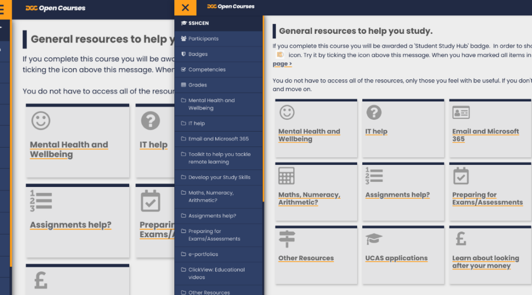
Collapsed Side Menu 
Open Side Menu


The side panel can be navigated easily by keyboard (this is part of Moodle Core so I didn’t need to add this in). It is also scrollable on small screens or when there’s a lot of content.
The main content re-adjusts as the side panel is opened and closed (see example in the second video). This is actually handled using CSS and media queries targeting the classes added by Moodle when the side panel is open or closed. I’ve added some example SCSS below.
.courses  {
	grid-template-columns: 1fr 1fr;
	nav,
	.paging-showall {
		grid-column-start: 1;
		grid-column-end: 3;
	}
	.drawer-open-left & {
		grid-template-columns: 1fr;
		nav,
		.paging-showall {
			grid-column-end: 2;
		}
	}
}
Handling Feedback and Adding in a Scroll Indicator
Initially I set the scrollbar to be invisible. I did this because on Windows machines the scrollbar is large, chunky and takes up a fair bit of space on the side panel. It also doesn’t look very aesthetically pleasing compared to the Mac OS scrollbar. We were also keen to maximise space for the learner where we could so I felt hiding it while keeping the area scrollable as you hovered over this area was a good choice.
Despite the scrollbar being invisible it was still easy to scroll the side panel by gesture (mobile devices) or by using the mouse scroll wheel when hovered over and as mentioned above it was possible to navigate via keyboard for accessibility.
However, thanks to feedback from one of our Lecturers Margaret, it became clear that on some devices which didn’t have good trackpad / scroll support the scrolling feature wasn’t working quite so well. It took a bit of back and forth to isolate the issue as every device I tested on windows or mac worked correctly and I’m very grateful for Margaret’s patience!
After some additional research into the issue and discovering the cause could be due to the trackpad support on certain devices I felt we needed to have some kind of indicator that could be clicked and dragged to :
- a) solve the issue Margaret had flagged
- b) to improve on the existing accessibility by giving a visual cue.
- c) make it more obvious that the section was scrollable
I also wanted to make sure that the scroll indicator didn’t take up too much space in the relatively small area and was consistent across devices and browsers.
For both methods (making invisible and changing the styling) I used CSS selectors that targeted the Shadow DOM.
The first code block is the original hidden scrollbar styling that uses the CSS selectors for the shadow DOM. There is some extra code to add support for old versions of IE (no longer an issue) and Firefox.
.scrollbar-hidden::-webkit-scrollbar {
	display: none;
}

/* Hide scrollbar for IE, Edge add Firefox */
.scrollbar-hidden {
	-ms-overflow-style: none;
	scrollbar-width: none; /* Firefox */
}
The second code block is the updated shadow DOM styling which just adjusts the look of the scrollbar so it is thinner but visible and matches the brand colours.
.scrollbar-thin::-webkit-scrollbar {
	width: 5px;
	height: 4px;
	cursor: pointer;
}
.scrollbar-thin::-webkit-scrollbar-thumb{
	background: $DGCOrange;
	border-radius: 0px;
}

.scrollbar-thin::-webkit-scrollbar-thumb:hover{
	background: $OrangeTint75;
	cursor: pointer;
}
.scrollbar-thin::-webkit-scrollbar-track{
	background: transparent;
	border-radius: 0px;
	box-shadow: inset 0px 0px 0px 0px #F0F0F0;
}
Further Reading on Styling Scrollbars using the Shadow DOM
There’s an excellent guide on CSS Tricks about using the shadow Dom to customise scroll bars linked below.
https://css-tricks.com/custom-scrollbars-in-webkit/
Further Improvements?
Web development is of course never done and it’s important to constantly think about how we can continue to improve the interface for users. There are a couple of things I’m thinking about in order to improve and develop this further.
- A “hover over” to show the menu item title when it’s hovered over when collapsed. This does sort of happen anyway if you hover for long enough but I think it would be a nice feature if it was more instantaneous.
- Checking that everything responds to the view area shrinking / growing – there may be a few areas that have been missed since Moodle is so huge and we have multiple extra course formats installed as well as hundreds of extra plugins.
- Work out what changes are needed for Moodle 4.
I hope to add these in future iterations of the theme or in my Moodle 4 upgrade.