Some notes, interesting quotes, videos and useful links for accessibility on the web and in apps that I’m noting down as I learn more about Accessibility.
Making the web and apps accessible can benefit more than just users with disabilities. It can help all users by making content easier to understand, easier to read, clearer and easier to access where connectivity is a problem.
As an example one of the first Typewriters was invented to help Pellegrino Turri’s blind friend to write more legibly.
The web and accessibility standards are constantly evolving and growing so we need to keep reviewing and improving our UX constantly. People also need to be continually trained on how to create accessible content. We all have a corporate social responsibility to make the web and apps accessible as well as a legal one. Accessibility is a human right.
Perceivable
Content should be presentable in different ways so it can be perceived by all users.
Operable
Websites and apps should be operable by all users regardless of disability
Understandable
Content should be understandable for all users.
Robust
Website, Apps and their content should be interpreted reliably by a variety of different devices.
For example do we really need 22 different buttons styles, when one or two would do?
Pattern Libraries can be useful in mitigating this across teams so team members can refer back to the reference.
“Interfaces that break too many rules may win design awards, but they’ll also alienate users. As a rule of thumb, users should be able to look at any part of your interface and think, “I’ve seen something like this before”. Not exactly like it, but like it.”
Videos should have closed captions for both blind and deaf users. Audio Descriptions can also be useful in making the videos understandable to blind or partially sighted users. Captions can be read out by screen readers so blind users can also follow along as well.
Captions are synchronised with the video content so they appear at the right time for users who can’t hear the spoken words or have trouble understanding what has been said.
YouTube will automatically create Closed Captions for you, but you should review these before publishing as they won’t be 100% accurate and may have some hilariously wrong translations in there. e.g. YouTube cannot translate the name of our college Dumfries and Galloway College.
Transcripts are optional for videos whereas captions are required. They can be useful for users who don’t want to watch the video and would rather have it read out to them.
They are essential for Audio only files such as Podcasts.
Signlanguage
Sign language can also be used on videos so a deaf user who knows sign language can follow the content. They can create a richer experience for deaf users whose first language may be sign language.
Alternative Text
Images and multimedia such as charts should have alternative text so that they can be read by Screen Readers or converted to brail and be understood by blind or partially sighted users. This is especially important where the image or non text media is used to impart information.
This text will depend a lot on context. For instance if you had a picture of a woman wearing a blue shirt and the context was a shopping website selling blue shirts you probably want the image alt text to mention that the woman is wearing a blue shirt and describe that shirt.
If the image has text in it that is readable you should reproduce this text in the alt tag as well.
Alt text should be succinct and understandable to the user.
Any empty alt tag indicates that the image is decorative and can be ignored this is not the same as a missing alt tag. You can also use aria-hidden=”true” but be aware that not every device will recognise this.
<img src="example.jpg" alt="A young woman in a floaty pale blue shirt" />
<img src="decorative.png" alt="" aria-hidden="true" />
Responsive websites can also help users when using zoom to resize the text on their screen to make it larger or smaller if they are coded correctly.
One size does not fit all!
Don’t assume that larger text is more accessible than small text. For some users this is not the case. Users with tunnel vision may actually prefer small text with tight linespacing because they can read more of the words at once making reading quicker and easier for them. This is why being able to adjust the text on the screen can be useful. Your web page should support adjusting text size so that text does not overlap when font size is increased. Avoiding fixed dimensions and using %’s, ems and rems rather than px or pt can help with this.
Target Size
Larger buttons, links an checkboxes with spacing around them are easier to hit or tap particularly by users who have poor motor control or tremors.
Colour Contrast
Colour contrast between textual information and its background should have a decent contrast so it is clear to the reader. Where colour is used as an indicator there should also be an alternative indicator for the colourblind so the differences are clear. E.g. underlines under text links.
“Colour (color) blindness (colour vision deficiency, or CVD) affects approximately 1 in 12 men (8%) and 1 in 200 women in the world. In Britain this means that there are approximately 3 million colour blind people (about 4.5% of the entire population), most of whom are male.”
“The contrast ratio should be at least 4.5:1 and ideally 7:1 for text. For graphical objects, such as charts, and for large text, a contrast ratio of 3:1 may be sufficient.”
Being able to easily disable audio in order to hear the output of a screen reader is a must.
Dark Modes / Light Modes
Having this option can help reduce glare or eyestrain. Some users may find content is easier to read by changing the setting to either dark mode or light mode.
Assistive Technologies
“Assistive Technologies refer to hardware or software that enable people with disabilities to interact and engage with the digital environment e.g. using a screen reader or a switch control.”
“Adaptive Strategies are techniques that people with disabilities use to interact with the digital environment such as adjusting platform and browser settings or resizing browser windows.”
These are used to help blind or low vision users to understand video content. They can also be useful to users with cognitive disabilities or users who are in noisy or quiet environments. They can also be used to help support children learning how to read.
Switch Inputs
These include:
Sip-and-puff switches which are triggered by sipping and puffing into a straw which then mimics tabbing and clicking.
Button switches which can be activated using the hand, foot or head. These can be single switches or multiple switches.
Camera switches which can be activated when tilting the head into a camera. Some mobile phones have this built into the accessibility settings.
Eye tracking, the process of measuring either the point of gaze (where one is looking) or the motion of an eye relative to the head.
Navigating by Keyboard or Switches
Links and Buttons should use standard HTML elements like <a> or <button> – this also applies for inputs and select fields.
Links and buttons should be labelled appropriately
links, buttons and inputs should be selectable and focusable using a keyboard.
Links and buttons should show when focus is on them using colour and another visual indicator.
Links and Buttons should follow a logical focus order. Left to right Top to bottom.
Table of the standard keystrokes:
Interaction
Keystrokes
Navigate to most elements
TabShift + Tab – navigate backward
Link
Enter
Button
Enter or Spacebar
Checkbox
Spacebar – check/uncheck a checkbox
Radio buttons
↑/↓ or ←/→ – select an optionTab – move to the next element
Select (dropdown) menu
↑/↓ – navigate between menu optionsSpacebar – expand
Autocomplete
Type to begin filtering↑/↓ – navigate to an optionEnter – select an option
Dialog
Esc – close
Slider
↑/↓ or ←/→ – increase or decrease slider valueHome/End – beginning or end
Menu bar
↑/↓ – Previous/next menu optionEnter – expand the menu (optional) and select an option.←/→ – expand/collapse submenu
Tab panel
Tab – once to navigate into the group of tabs and once to navigate out of the group of tabs↑/↓ or ←/→ – previous/next tab.
‘Tree’ menu
↑/↓ – Navigate Previous/next menu option←/→ – expand/collapse submenu, move up/down one level
Common screen readers include Jaws for Windows, NVDA for Windows, Narrator bundled with Windows, VoiceOver bundled with MacOS and iOS, and TalkBack bundled with Android.
Content should be laid out in a structured way
Headings should follow a standard hierarchical order
Skip to Content links should be included
Links should have understandable labels not just “Click Here”
Remember : Not all Screen Reader users are blind. Some are partially sighted, some may have cognitive difficulties with reading text, some may be audio learners, some may may just want to listen to text being read out while they do other things.
How to Navigate your iPhone or iPad with VoiceOver (Apple Support)
Using Voice Over Example
1. Switch VO on and off
To switch on VoiceOver go to Settings → General → Accessibility → VoiceOver then activate the VoiceOver ‘on’ switch to enable it.
2. Map the accessibility shortcut key
Before you start navigating, please set up the Accessibility shortcut menu. It is recommended you do this as it makes testing a lot quicker and easier as you don’t have to go into settings each time to switch VoiceOver on and off. Once set up, you are able to switch the accessibility features on and off using triple click on the side button (home button for older devices).
To enable this go to Settings → General → Accessibility → Accessibility Shortcuts and select VoiceOver and Zoom from the list of options. When you want to switch VoiceOver or Zoom on and off quickly, all you need do is triple click the side or home button to activate the menu to select VoiceOver or Zoom.
3. Complete the VoiceOver tutorial
Using the gestures below complete the VoiceOver tutorial. To do this go to Settings → General → Accessibility → VoiceOver, turn VoiceOver ‘on’ and select VoiceOver Practice.
Explore by touch: drag your finger over the screen to have VoiceOver describe the items under your finger. You can tap with a second finger or double-tap to open links, press buttons, and so on.
Gesture navigation: swipe right with a single finger to move from one item to the next in sequence, swipe left to go backward through this sequence. VoiceOver describes items as you move focus around the screen.
Announce an element: single tap sets focus on an element so it is announced.
Activate an element: double-tap a single finger to open links, press buttons, and navigate using the Rotor.
Open the Rotor: turn a dial with two fingers to open the Rotor. Drag your finger around the dial to choose headings from the list of items.
Jump between element: swipe up and down to jump between headings.
Screen curtain: with three fingers, quickly triple-tap the screen to turn it on and off. If the Zoom feature is in use with VoiceOver, tap the screen four times with three fingers.
Assistive Tech: TalkBack on Android
Digital Braille Display
Users who are blind and read braille may combine a screen reader with a hardware called a refreshable braille display. This sits next to the keyboard and is made up of hundreds of pins that move to create the braille. There are also smaller, portable, Bluetooth braille displays that can connect to mobiles and tablets, and be used on the move.
Allows users who are blind and deaf to read text on the web or blind users to read text quietly.
Content should be laid out in a structured way
Headings should follow a standard hierarchical order
Links should have understandable labels not just “Click Here”
Skip to Content links should be included
Speech to Text / Voice Over
Allows users to navigate and interact with the web using their voice. This helps users with limited dexterity or muscular control limitations, paralysis or missing limbs.
Links and Buttons should use standard HTML elements like <a> or <button> – this also applies for inputs and select fields.
Links and buttons should be labelled appropriately
links, buttons and inputs should be selectable and focusable using only voice.
Links and buttons should show when focus is on them using colour and another visual indicator.
Inputs option to be speech activated so text can be inputted by speaking.
Authoring Tool Accessibility Guidelines (ATAG) defines requirements on how to make the authoring tools themselves accessible, so that people with disabilities can create web content. It also defines requirements how authors can create accessible web content and conform to WCAG
User Agent Accessibility Guidelines (UAAG) provides guidance on how to make user agents accessible to people with disabilities. User agents include browsers, browser extensions, media players, readers and other applications that render web content
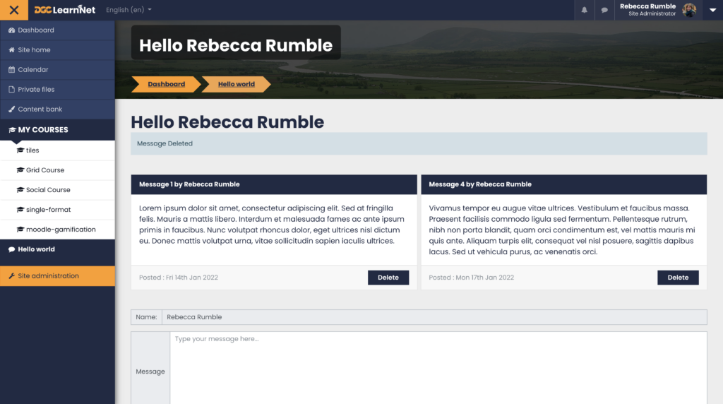
I have just completed the free Plugin Development course with Moodle Academy and I highly recommend it for anyone looking to learn how to code their own Moodle plugins. I completed the training so that I can better create Moodle plugins to help support our staff and students using our VLE LearnNet at the college.
Here’s a screenshot of my version of the Hello World plugin the course gets you to create.
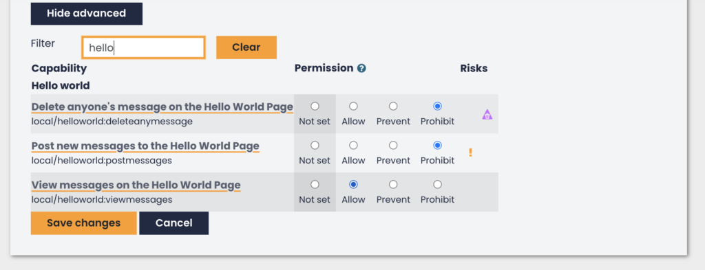
Includes some custom capabilities and Italian translations.
Looking forward to creating some more plugins for our staff and students in the future…
With the launch of the college’s new branding and a planned Moodle upgrade our Moodle theme needed a refresh. Over the last 6 years or so I’ve built numerous WordPress themes from scratch so I took on a new challenge and looked at the Moodle Documentation and began learning how to building our own using the college’s new colours and fonts.
This was entirely new to me as I only started picking up Moodle when I joined the College in December 2019 and had to pick it up rather quickly given the pandemic.
Design Principals
There were a few things I was keeping in mind.
To maximise the space as much as possible for the Lecturers and Students
There were (and still are) a few barriers to building the theme. Some of these will disappear once we are able to move to the new course layout that my colleague Steve has designed and developed. For now we need to support the legacy setup.
Multiple course formats have been installed into the existing VLE and need to be supported. I focused on the CORE functionality to start with then started working on adding in support as we worked out what course formats were still being used.
Multiple plugins have been installed into the existing VLE over the years and some need to be supported. This caused unexpected conflicts at points that took time to diagnose. Eventually our plan is to install a fresh Moodle with Steve’s course layout and we will go through and remove unnecessary plugins
Overview of the new design.
To break this very long post up I have separated out each component into a separate post. Some of the changes were simple changes to the SCSS files and others involved output renderer overrides. Click on each of the post embeds to find out more.
This post is part of a series documenting the work I did while developing a new Moodle Theme for Dumfries and Galloway College’s VLE. There will be further posts to follow. Watch this space!
Modifying the navigation panel was a fairly small change from the base boost theme this theme was based on. The main changes made were :
Animating the menu toggle button along the top using the excellent CSS library by Jonathan Sue. Note : rather than include the entire library I only included the SCSS being used.
Modifying the side panel so when minimised you could still see and click on the icons.
Modifying how the scrollbar displayed
Collapsed Side Menu
Open Side Menu
The side panel can be navigated easily by keyboard (this is part of Moodle Core so I didn’t need to add this in). It is also scrollable on small screens or when there’s a lot of content.
The main content re-adjusts as the side panel is opened and closed (see example in the second video). This is actually handled using CSS and media queries targeting the classes added by Moodle when the side panel is open or closed. I’ve added some example SCSS below.
Handling Feedback and Adding in a Scroll Indicator
Initially I set the scrollbar to be invisible. I did this because on Windows machines the scrollbar is large, chunky and takes up a fair bit of space on the side panel. It also doesn’t look very aesthetically pleasing compared to the Mac OS scrollbar. We were also keen to maximise space for the learner where we could so I felt hiding it while keeping the area scrollable as you hovered over this area was a good choice.
Despite the scrollbar being invisible it was still easy to scroll the side panel by gesture (mobile devices) or by using the mouse scroll wheel when hovered over and as mentioned above it was possible to navigate via keyboard for accessibility.
However, thanks to feedback from one of our Lecturers Margaret, it became clear that on some devices which didn’t have good trackpad / scroll support the scrolling feature wasn’t working quite so well. It took a bit of back and forth to isolate the issue as every device I tested on windows or mac worked correctly and I’m very grateful for Margaret’s patience!
After some additional research into the issue and discovering the cause could be due to the trackpad support on certain devices I felt we needed to have some kind of indicator that could be clicked and dragged to :
a) solve the issue Margaret had flagged
b) to improve on the existing accessibility by giving a visual cue.
c) make it more obvious that the section was scrollable
I also wanted to make sure that the scroll indicator didn’t take up too much space in the relatively small area and was consistent across devices and browsers.
For both methods (making invisible and changing the styling) I used CSS selectors that targeted the Shadow DOM.
The first code block is the original hidden scrollbar styling that uses the CSS selectors for the shadow DOM. There is some extra code to add support for old versions of IE (no longer an issue) and Firefox.
The second code block is the updated shadow DOM styling which just adjusts the look of the scrollbar so it is thinner but visible and matches the brand colours.
Web development is of course never done and it’s important to constantly think about how we can continue to improve the interface for users. There are a couple of things I’m thinking about in order to improve and develop this further.
A “hover over” to show the menu item title when it’s hovered over when collapsed. This does sort of happen anyway if you hover for long enough but I think it would be a nice feature if it was more instantaneous.
Checking that everything responds to the view area shrinking / growing – there may be a few areas that have been missed since Moodle is so huge and we have multiple extra course formats installed as well as hundreds of extra plugins.
Work out what changes are needed for Moodle 4.
I hope to add these in future iterations of the theme or in my Moodle 4 upgrade.
This post is part of a series for documenting the work I did building a new Moodle Theme for our VLE’s. More to follow…
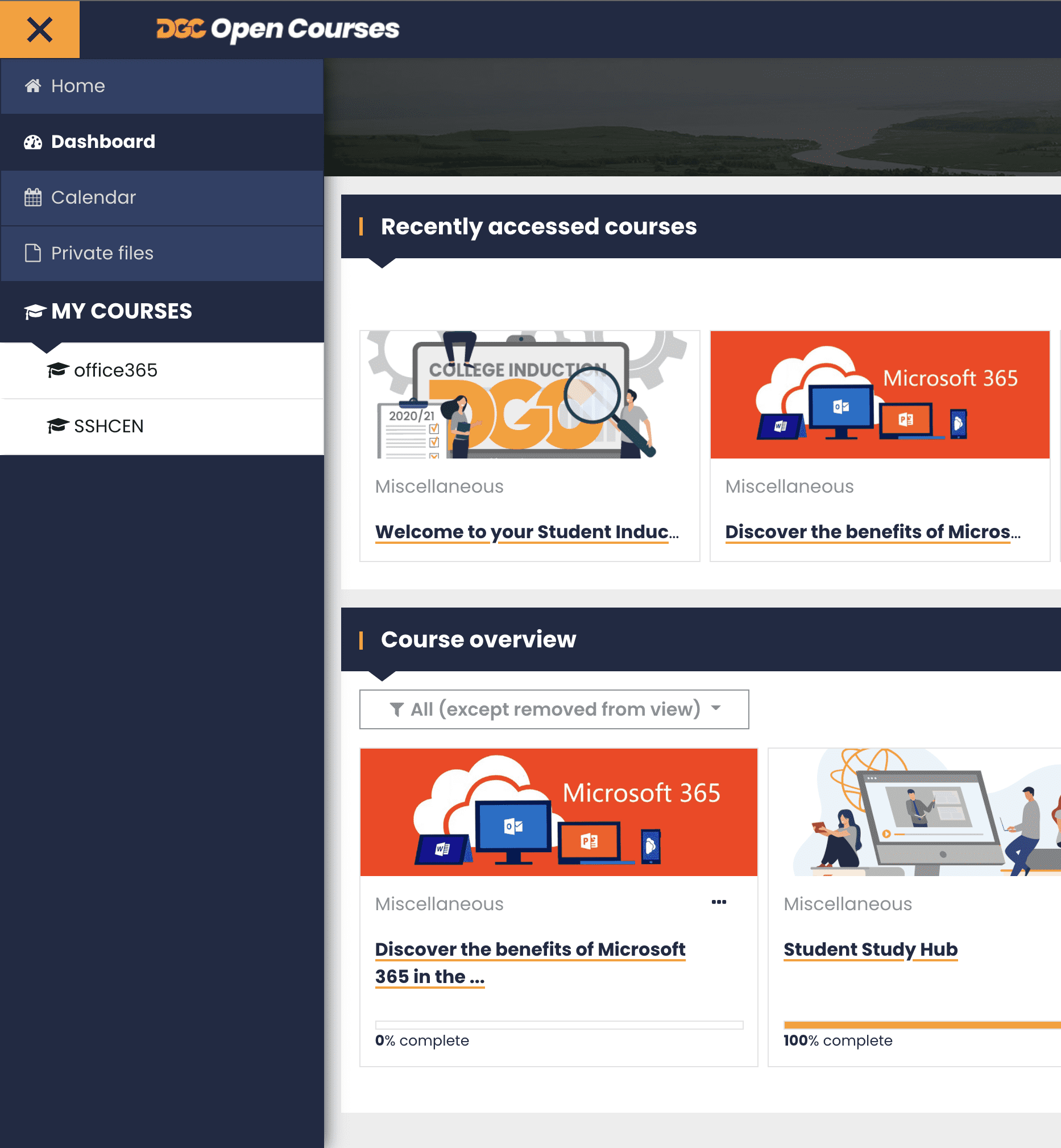
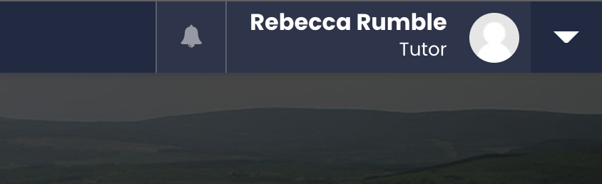
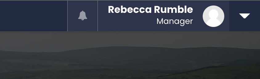
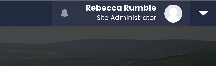
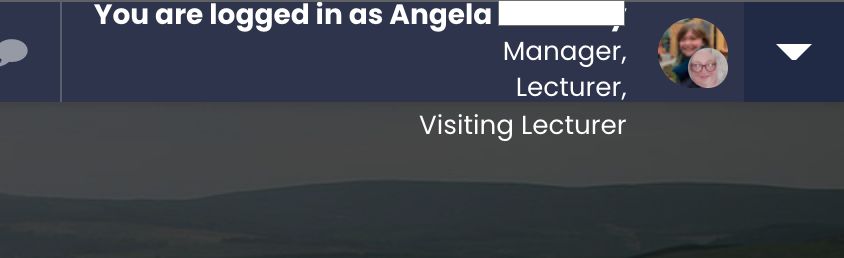
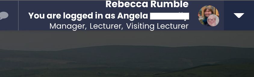
We have many different user roles in our VLE. I wanted a way to show this clearly at the top just under the user’s name at the top.
How I set this up….
This wasn’t a simple task as it turned out I needed to override a core library output renderer in order to complete the task. The renderer function I needed to override can be found in /lib/outputrenderers.php
My Theme’s renderer override class lives in : /theme/nameoftheme/renderers.php I’m extending the core_renderer here Line 517 of lib/outputrenderers.php so the class should have “… extends core_renderer” when it’s declared.
I copied in the user_menu function into the theme’s override class so I can override it. On what would be line 3371 of the original file I replace the role section with a call to a function I’ve created in the override class called show_user_roles (see further down). This function should return a HTML String that describes the roles the current user is in.
defined('MOODLE_INTERNAL') || die();

class theme_nameoftheme_core_renderer extends core_renderer {

     // Original Function in /lib/outputrenderers.php
     public function user_menu($user = null, $withlinks = null) {

          ...

          // fetch all role information....
          $usertextcontents .= $this->show_user_roles($user, $opts);

          ...

     }

}
// Original user_menu function
public function user_menu($user = null, $withlinks = null) {

     ...

     // Role. (Line 3371 of original)
     if (!empty($opts->metadata['asotherrole'])) {
          $role = core_text::strtolower(preg_replace('#[ ]+#', '-', trim($opts->metadata['rolename'])));
          $usertextcontents .= html_writer::span(
               $opts->metadata['rolename'],
                'meta role role-' . $role
          );
     }

     ...

}
public function show_user_roles($user = null, $opts = null) {
	// fetch all role information....
	$systemcontext = context_system::instance();
	$allRoles = role_fix_names(get_all_roles(), $systemcontext, ROLENAME_ORIGINAL);
	$usertextcontents = '';

	$usertextcontents .= html_writer::start_span('roles d-flex justify-content-end');


	// Role.
	if (!empty($opts->metadata['asotherrole'])) { // Logged in as....
		$role = core_text::strtolower(preg_replace('#[ ]+#', '-', trim($opts->metadata['rolename'])));
		$usertextcontents .= html_writer::span(
		$opts->metadata['rolename'],
			'meta role role-' . $role
		);
	} else {
		if(is_siteadmin()) { // Is Site Administrator
			$usertextcontents .= html_writer::span(
				'Site Administrator',
				'meta role role-admin'
			);
		} else { // possibly another role....

			$ismanagerorlecturer = false;
			foreach($allRoles as $key => $role) {

				if(user_has_role_assignment($user->id,$key)) {

					if(in_array($role->shortname, array(...))) {
						// skip these ones :).
					} else {
						if(in_array($role->shortname, array('manager','editinglecturer','teacher','visitinglecturer') ) ) {
							$ismanagerorlecturer = true;
						}

						// some lectureres are listed as students as well which seems sort of pointless to display this...
						if($role->shortname != 'student' || ($role->shortname == 'student' && !$ismanagerorlecturer)) {
							$usertextcontents .= html_writer::span(
								$role->localname,
									'meta role role-' . $role->shortname
							);
						}
					}
				}
			}
		}
	}

	$usertextcontents .= html_writer::end_span();

	return $usertextcontents;
}
That’s quite a bit so here’s a breakdown of what this script is doing:
Line 4 : Fetch all the user roles used on the site ($allRoles)
Line 5 : Create a string to store the html in ($usertextcontents = ”;)
Line 11 : Check if the current user is masquerading as another role e.g. a Lecturer viewing as a “Student” (if (!empty($opts->metadata[‘asotherrole’])) {)
Line 12 : turn the role name into a class (i.e. remove spaces etc)
Line 13 : Create a span for the role.
Line 17 : If current user isn’t masquerading….
Line 18 : Check if current user is a Site Admin….
Line 19 : Create a span for this role.
Line 23 : All users except the site admin….
Line 25 : This is a check to see if the user is a manager / lecturer since they may have multiple roles so we might want to skip some!
Line 26 : cycle through $allRoles
Line 28 : Check if current user has this role
Line 30 : This line I’m checking to see if this is one of the roles we should skip (we have some extra roles to set certain permissions for a custom course activity so we don’t want to display these since no one will care much about these)
Line 33 : Checking to see if the current user is in a manager / lecturer role in which case we set the flag to true.
Line 38 : If the role isn’t “Student” OR if the role is “Student” AND the user isn’t a manager or lecturer create a span for this role.
Line 52 – function returns the finished HTML string.
Handling a user with Multiple Roles
But what if the user has multiple roles?
When I initially wrote this I didn’t have the bit where I check for manager / lecturer or the bit where I skip some of the extra roles.
For some users where they were in multiple different roles on the site made it display weirdly as there wasn’t enough space.
If they are viewing as a specific role we won’t see the additional roles (this is handled on line 11)
To deal with this. I first added the check for manager / lecturer since those roles we don’t really care that they are also in a student role.
I also hid some of the irrelevant roles we don’t care about by skipping them in the loop.
This reduced the list down from about 10 roles to maybe 3 but it was still displaying in a column.
I added some bootstrap classes (boost and my theme uses BootStrap) and CSS to handle this.
This may need further improvements if the user is a member of even more roles but so far it hasn’t been an issue for me. I will revisit this if it becomes and issue.
What about Mobile?
On mobile I’m collapsing it down to make it more minimal.
Further Improvements?
I’m wondering if it’s a bit wasteful to fetch $allRoles everytime and if there is someway I can cache it (like set_transient does on WordPress). It won’t change very often.
There may be further ways to optimise the code and I’m open to suggestions.
This post is part of a series documenting the work I did while developing a new Moodle Theme for Dumfries and Galloway College’s VLE. There will be further posts to follow. Watch this space!
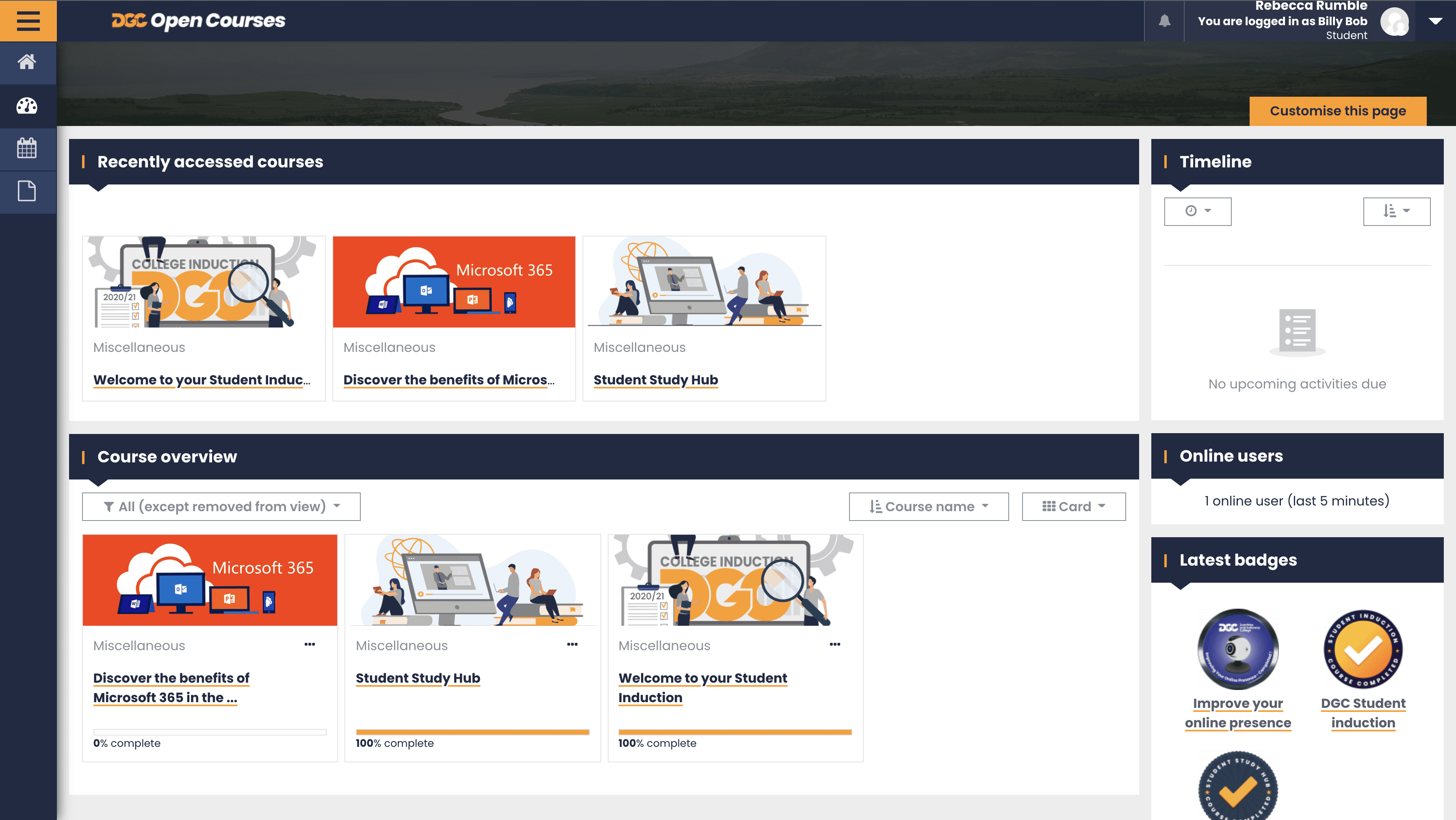
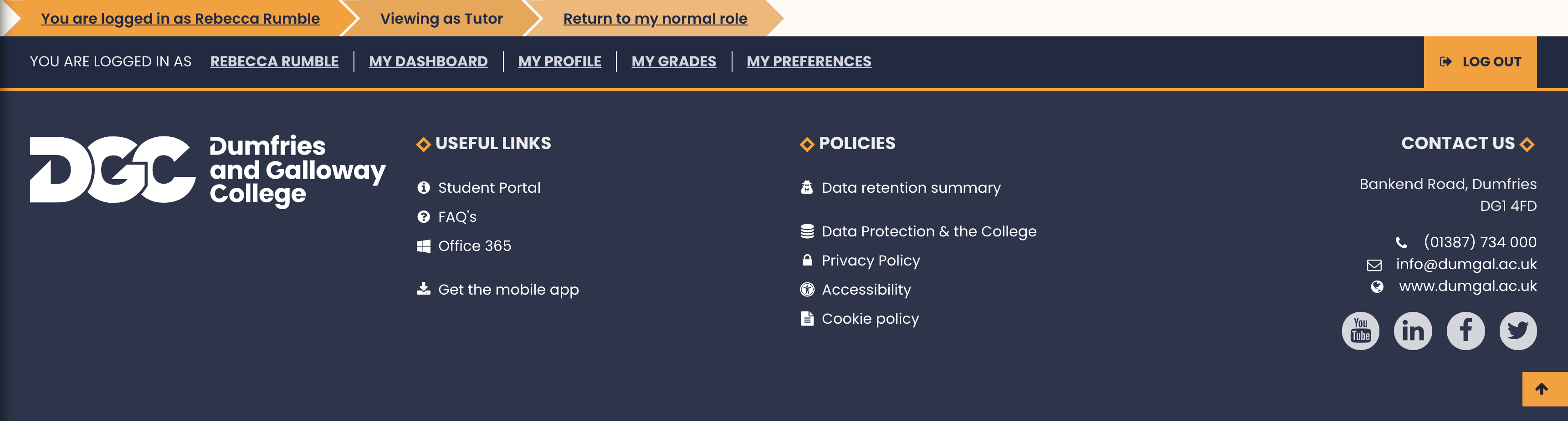
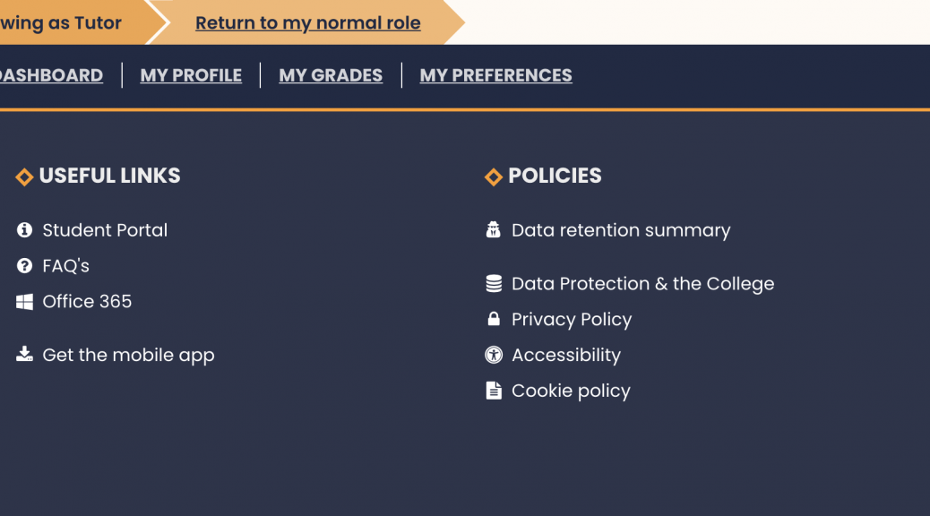
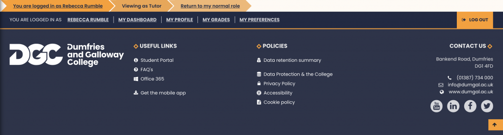
As part of the design I wanted to display the “logged in as” information in a visually appealing way. For anyone not familiar with the log in as option, in Moodle certain user roles can preview courses as a different role e.g. as a Student. I settled on displaying it as a set of arrows across the top of the footer (see screenshot) rather than an un-styled block of text which was buried in the footer of the default theme boost.
For the style of the breadcrumb arrows I reused my SVG clip-path Breadcrumb SCSS and HTML that I wrote earlier in the year for another project. See the link below for an overview of the SCSS.
Modifying the Footer Mustache File and Theme Renderers
To achieve this I needed to modify the mustache template file footer.mustache as well as write a renderer override in our theme. I based the new theme as a child version of the default Boost theme.
To override the footer.mustache file in boost I had to create a new footer.mustache file in our theme templates folder. This started out as a copy of the boost theme’s footer.mustache.
To figure out what renderer function I needed to find I ran a grep on my copy of moodle and discovered that the “Logged in as” information was being pulled into the footer.mustache file by the following line of code
{{{ output.login_info }}}
I tracked this down to coming from the login_info function in /lib/outputrenderers.php
/**
* Return the standard string that says whether you are logged in (and switched
* roles/logged in as another user).
* @param bool $withlinks if false, then don't include any links in the HTML produced.
* If not set, the default is the nologinlinks option from the theme config.php file,
* and if that is not set, then links are included.
* @return string HTML fragment.
*/
public function login_info($withlinks = null) {

    //...

}
This function also included a lot of information that also appeared in the footer which meant I needed to write an override renderer for login_info in our theme as well as an extra renderer to separate out the “Logged in as” information and display it separately.
I added the override and the new renderer to my theme renderers files ( theme_name/renderers.php ).
The override of login_info was to start with a straight copy of the original function with the “Logged in as” part removed from it. To differentiate it from the original (and to make it easy to swap out if there were any issues) I renamed the override “footer_logininfo” and commented out any information I didn’t want to include in the footer itself. I also added in a few html elements to accommodate the breadcrumb styling. You may notice I have also changed some of the styling – this is due to another change to the footer that I may explain in a later post.
/**
* Based on the login_info Function in /lib/outputrenderers.php
* The following changes have been made:
* $string['loggedinas'] changed in language package
Logout link taken out of logged in link.
Logged in as taken out to move into a new section
*
* Construct a user menu, returning HTML that can be echoed out by a
* layout file.
*
* @param stdClass $user A user object, usually $USER.
* @param bool $withlinks true if a dropdown should be built.
* @return string HTML fragment.
*/
public function footer_logininfo($withlinks = null) {
global $USER, $CFG, $DB, $SESSION;
if (during_initial_install()) {
return '';
}
if (is_null($withlinks)) {
$withlinks = empty($this->page->layout_options['nologinlinks']);
}
$course = $this->page->course;
if (\core\session\manager::is_loggedinas()) {
$realuser = \core\session\manager::get_realuser();
$fullname = fullname($realuser, true);
if ($withlinks) {
$loginastitle = get_string('loginas');
$realuserinfo = " [<a href=\"$CFG->wwwroot/course/loginas.php?id=$course->id&sesskey=".sesskey()."\"";
$realuserinfo .= "title =\"".$loginastitle."\">$fullname</a>] ";
$realuserinfo = '';
} else {
$realuserinfo = " [$fullname] ";
$realuserinfo = '';
}
} else {
$realuserinfo = '';
}
$loginpage = $this->is_login_page();
$loginurl = get_login_url();
if (empty($course->id)) {
// $course->id is not defined during installation
return '';
} else if (isloggedin()) {
$context = context_course::instance($course->id);
$fullname = fullname($USER, true);
// Since Moodle 2.0 this link always goes to the public profile page (not the course profile page)
if ($withlinks) {
$linktitle = get_string('viewprofile');
$username = "<a href=\"$CFG->wwwroot/user/profile.php?id=$USER->id\" title=\"$linktitle\"><span>$fullname</span></a>";
} else {
$username = $fullname;
}
if (is_mnet_remote_user($USER) and $idprovider = $DB->get_record('mnet_host', array('id'=>$USER->mnethostid))) {
if ($withlinks) {
$username .= " from <a href=\"{$idprovider->wwwroot}\"><span>{$idprovider->name}</span></a>";
} else {
$username .= " from {$idprovider->name}";
}
}
if (isguestuser()) {
$loggedinas = $realuserinfo.get_string('loggedinasguest');
if (!$loginpage && $withlinks) {
$loggedinas .= " (<a href=\"$loginurl\">".get_string('login').'</a>)';
}
} else if (is_role_switched($course->id)) { // Has switched roles
/*$rolename = '';
if ($role = $DB->get_record('role', array('id'=>$USER->access['rsw'][$context->path]))) {
$rolename = ': '.role_get_name($role, $context);
} */
$loggedinas = get_string('loggedinas', 'moodle', $username).$rolename;
/*if ($withlinks) {
$url = new moodle_url('/course/switchrole.php', array('id'=>$course->id,'sesskey'=>sesskey(), 'switchrole'=>0, 'returnurl'=>$this->page->url->out_as_local_url(false)));
$loggedinas .= ' ('.html_writer::tag('a', get_string('switchrolereturn'), array('href' => $url)).')';
} */ // Going to move this to a seperate section.
} else {
$loggedinas = $realuserinfo.get_string('loggedinas', 'moodle', $username);
/*if ($withlinks) {
$loggedinas .= " (<a href=\"$CFG->wwwroot/login/logout.php?sesskey=".sesskey()."\">".get_string('logout').'</a>)';
} */
}
} else {
$loggedinas = get_string('loggedinnot', 'moodle');
if (!$loginpage && $withlinks) {
$loggedinas .= " (<a href=\"$loginurl\">".get_string('login').'</a>)';
}
}
//$loggedinas = '<div class="logininfo">'.$loggedinas.'</div>';
if (isset($SESSION->justloggedin)) {
unset($SESSION->justloggedin);
if (!empty($CFG->displayloginfailures)) {
if (!isguestuser()) {
// Include this file only when required.
require_once($CFG->dirroot . '/user/lib.php');
if ($count = user_count_login_failures($USER)) {
$loggedinas .= '<div class="loginfailures">';
$a = new stdClass();
$a->attempts = $count;
$loggedinas .= get_string('failedloginattempts', '', $a);
if (file_exists("$CFG->dirroot/report/log/index.php") and has_capability('report/log:view', context_system::instance())) {
$loggedinas .= ' ('.html_writer::link(new moodle_url('/report/log/index.php', array('chooselog' => 1,
'id' => 0 , 'modid' => 'site_errors')), get_string('logs')).')';
}
$loggedinas .= '</div>';
}
}
}
}
return '<li>'.$loggedinas.'</li>';
}
I then added a new renderer function called “footer_signedinas” which is where I moved the “logged in as” information to and added the necessary breadcrumb elements so I could use my clip path styling.
public function footer_signedinas($withlinks = null) {
global $USER, $CFG, $DB, $SESSION;
if (during_initial_install()) {
return '';
}
if (is_null($withlinks)) {
$withlinks = empty($this->page->layout_options['nologinlinks']);
}
if (\core\session\manager::is_loggedinas()) {
$realuser = \core\session\manager::get_realuser();
$fullname = fullname($realuser, true);
if ($withlinks) {
$loginastitle = get_string('loginas');
$realuserinfo = '<li><a href="'.$CFG->wwwroot.'/course/loginas.php?id='.$course->id.'&sesskey='.sesskey().'"';
$realuserinfo .= ' title ="'.$loginastitle.'">'.$fullname.'</a></li>';
} else {
$realuserinfo = '<li><span>['.$fullname.']</span></li>';
}
} else {
$realuserinfo = '';
}
$loggedinas = '';
$course = $this->page->course;
if (isloggedin()) {
$context = context_course::instance($course->id);
$fullname = fullname($USER, true);
//$linktitle = '';
// Since Moodle 2.0 this link always goes to the public profile page (not the course profile page)
if ($withlinks) {
//$linktitle = get_string('viewprofile');
$profilelink = $CFG->wwwroot.'/user/profile.php?id='.$USER->id;
//$username = '<a href="'.$CFG->wwwroot.'/user/profile.php?id='.$USER->id.'" title="'.$linktitle.'">'.$fullname.'</a>';
$username = $fullname;
} else {
$profilelink = '';
$username = $fullname;
}
if (is_mnet_remote_user($USER) and $idprovider = $DB->get_record('mnet_host', array('id'=>$USER->mnethostid))) {
if ($withlinks) {
$profilelink = $idprovider->wwwroot;
$username .= " from {$idprovider->name}";
} else {
$profilelink = '';
$username .= " from {$idprovider->name}";
}
}
if (is_role_switched($course->id)) { // Has switched roles
$rolename = '';
if ($role = $DB->get_record('role', array('id'=>$USER->access['rsw'][$context->path]))) {
$rolename = '<li><span>'.get_string('viewingasrole', 'theme_dgcollege2020', role_get_name($role, $context)).'</span></li>';
//viewingasrole
}
$loggedinas = '<div class="switchedrole breadcrumb-wrapper bg-dorange-5" role="complementary" aria-label="Switch User Role Information">'.
'<ul class="breadcrumbs">';
$loggedinas .= (!empty($profilelink) ? '<li><a href="'.$profilelink.'">' : '<li><span>').get_string('loggedinas', 'moodle', $username).(!empty($profilelink) ? '</a></li>' : '</span></li>').$rolename;
// signedinaslinktext
if ($withlinks) {
$url = new moodle_url('/course/switchrole.php', array('id'=>$course->id,'sesskey'=>sesskey(), 'switchrole'=>0, 'returnurl'=>$this->page->url->out_as_local_url(false)));
$loggedinas .= '<li>'.html_writer::tag('a', get_string('switchrolereturn'), array('href' => $url, 'class' => '')).'</li>';
}
$loggedinas .= '</ul></div>';
} else if(\core\session\manager::is_loggedinas()) {
$loggedinas = '<div class="switchedrole bg-dorange-5" role="complementary" aria-label="Logged in as Information">'.
'<ul class="breadcrumbs">';
$loggedinas .= $realuserinfo.'<li><span>'.get_string('loggedinas', 'moodle', $username).'</span></li>';
if ($withlinks) {
$loggedinas .= '<li><a href="'.$CFG->wwwroot.'/login/logout.php?sesskey='.sesskey().'">'.get_string('logout').'</a></li>';
}
$loggedinas .= '</ul></div>';
}
}
return $loggedinas;
}
Finally I needed to reference these new overrides in our theme’s footer.mustache file. This is done by adding {{{ output.function_name }}} this will fetch the output of those renderers.